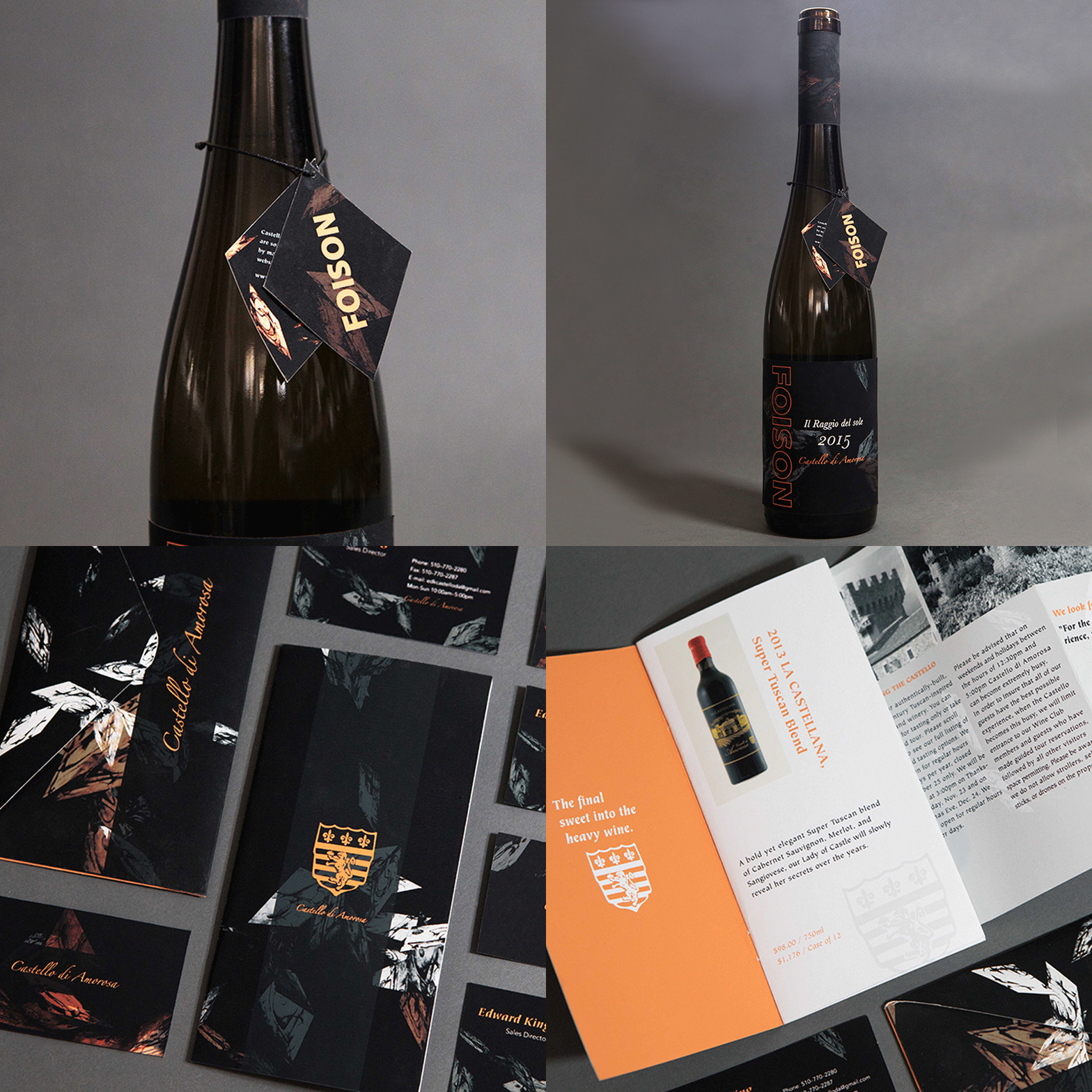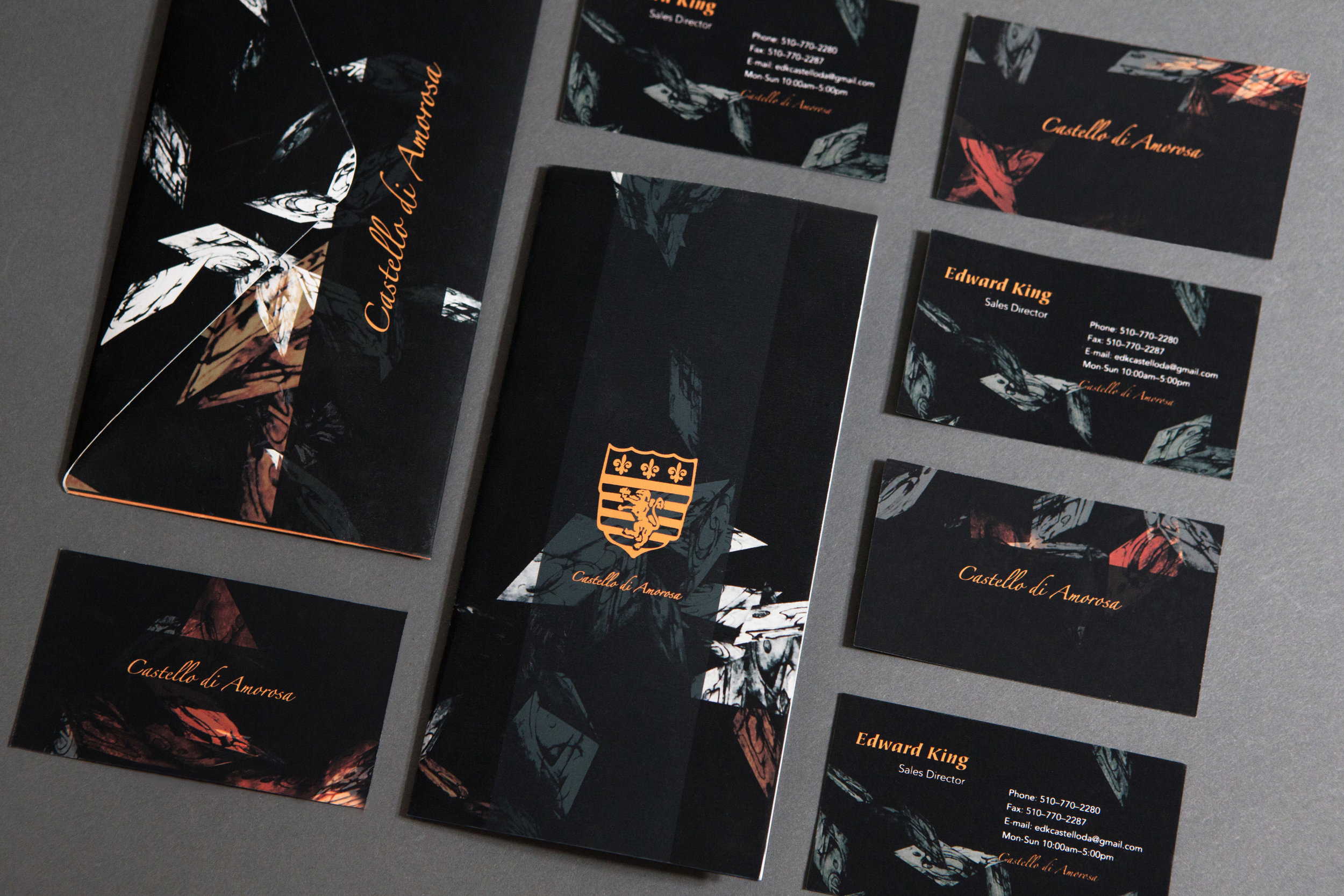
Castello di Amorosa Wine Packaging Design
Book jacket design for Tomas Cizek's The Ruse


Castello di Amorosa Wine Packaging Design
Time On The Vine
[ OBJECTIVE ]
Analyze a poem from an unknown foreign language in its own typeface. From the first impression of this typeface, create a patten, then use the patten combined with the translation of the poem to design Castello di Amorosa wine packaging.
[ APPROACH ]
I picked some unique letters of the typeface and they had movement. I created many variations to show how the letters combined together. Then, I used the variations to create a type cube and took many photos of the cube under different lights. The poem was about autumn and harvest, so I decided to cut the photos of the type cube and used the resulting shapes to create the look of fallen leaves. Finally, I used this pattern to design the wine packaging for Castello di Amorosa.
